iOS checkout
The legacy checkout was a web view on the iOS app, the purpose of this project was build a fully native checkout.
My role: Lead UX.UI · iOS
Problem space
As the legacy checkout was using a web view the experience was not tailor made for an iOS device and as a result the CVR rate was lower than expected and had a lack of transparency on the process.
FocusWhat is the process for a user to go from a basket to checkout completion
What technical details need to be simplified for user to understand
How to provide transparency on the checkout steps
What issues were users having with the legacy view
Research & insights
On this project I used a combination of UX audits to gain a deeper understanding of any usability issues and user testing sessions to test new design hypothesis.
UX audit
From the audit one of the key takeaways was there was no way for the user to understand how long the checkout process was.
There was no quick way of going back to previous step without loosing your progress.
The payment and billing address was very complicated due to how the technology worked and wasn’t translated into an experience that was user friendly.
There was no express checkout for super users who had saved their details previously
Translating technical issues
There was a complex payment and billing address solution that had been implemented in the back-end, this wasn’t understood by users and made it difficult when trying to add new payment methods which became a large friction point.


Design decisions
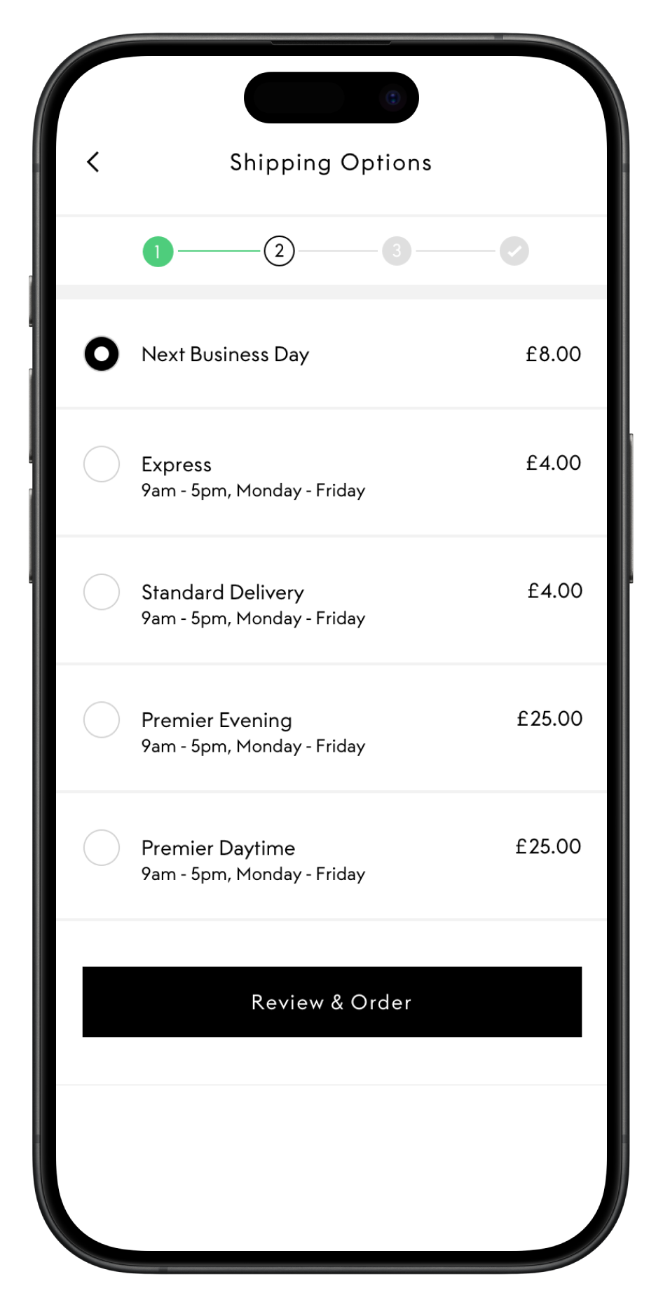
Progress & step counter
The addition of a progress & step counter helped users to identify how many steps are involved in the checkout process. This upfront knowledge gave confidence in knowing when they would press the final purchase button
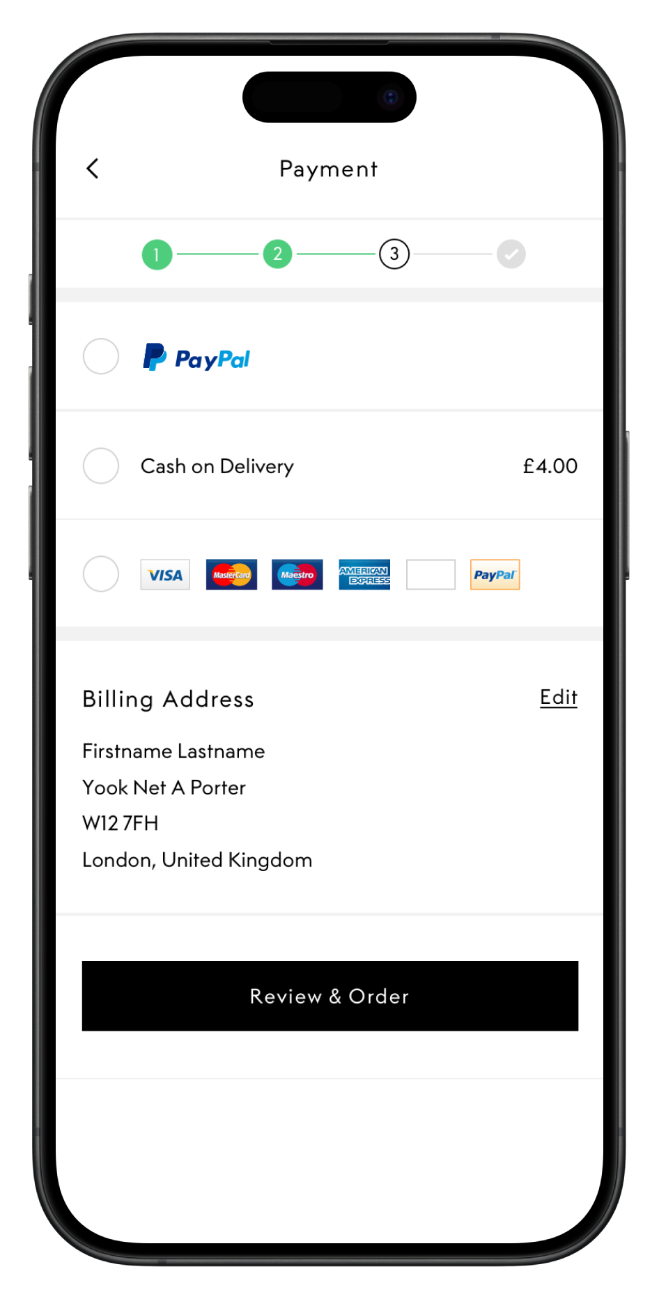
Payment process
Previously when adding a new payment method the user would have to re enter their billing address even if they had used it before. To reduce this friction I expanded on the saved cards section and added a saved address section. This could accessed when adding new card details or delivery addresses removing additional steps.
Overview screen
The overview screen helped users to clearly understand how long the process was and what steps had been filled out at a glance. From a single view they could see all their details and the order value.
1 click checkout
For super users who had all their details saved the overview screen became extremely useful in allowing them to checkout with just a single click. This was done by presenting the user with all their saved information and the only entry needed was their CVV.
Working with engineering
On this project I worked closely with engineering teams throughout so I had a deeper understanding of how the backend technology worked before coming with design solutions.
The constant communication also meant I was able to provide short informal demos to receive feedback from the team and it also gave the chance for engineering teams to have an input.
Outcome
This project was a success and led to an increase in CVR and helped to reduce the time it took to checkout
+13%
CVR YoY
-38%
Time taken to complete checkout
-21%
Bounce rate from checkout